
 0
0
3.1 Content Types
| Content-Type | Description |
| Author Profile | Used to highlight content authors and presenters of events, blogs, and resources. |
| Basic Page | A flexible content type used to create pages that do not have highly structured content elements, e.g.: “About Us”. |
| Blog Post | Used to create blog posts. |
| Branch | Branches are generated from CORE and relevant data is synced regularly. You cannot Add Branches in the CMS, only edit. |
| Chapter | Chapters are generated from CORE and relevant data is synced regularly, several elements are configurable in the CMS. |
| Event | Used for all Events: National Events, Live Webinars, Recorded Webinars, Courses, and Local Events. |
| Headline | Used for news item or press releases. |
| Landing Page | A page designed to display a collection of content around one or many classifications. The homepage, Find a Mentor, Take a Workshop, and Browse Library pages are all landing pages and are constructed using content bands. |
| Mentor Profile | Mentor Profiles are synced from the CORE system |
| Resource | Add a resource, such as a template or a tool. |
| Success Story | Create a Success Story |
3.2 Adding a Node
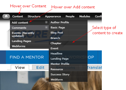
Each piece of content you create is called a node (i.e., a page). To add a node, navigate to the admin menu. Hover over Content, then from the drop menu hover over add content, then select the content type that you would like to create. Alternately, click on Content in the admin menu bar, then click Add content and then select the content type to create from the list.
After selecting a new node type two sets of tabs will be visible on the left side. The top set of tabs are specific to the content type you’re using. The bottom set of tabs are page options that you’ll find on every node on the site.
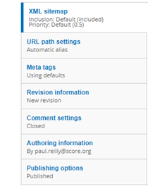
Figure 3-2 - General Page Options
It is recommended that you review every field in every tab and fill out the information as completely as possible. Some fields will not apply to the selected content type and can be left blank. For instance in the event content type, if adding a recorded webinar, date and time are not needed and can be left blank. However, there are some fields on all content types that should be completed every time. These include:
1.3.1 Content Type Options
3.3.1.1 Summary:
The summary is what appears in the content list on landing pages and search. If the summary is left blank, then the first few lines of the body copy will be displayed. The summary is also used as the page meta description (unless changed). So it is important that this is filled out whenever possible. This appears at the top of most pages just below the title and subtitle fields. You must click to display the summary field on the page. See the image below.
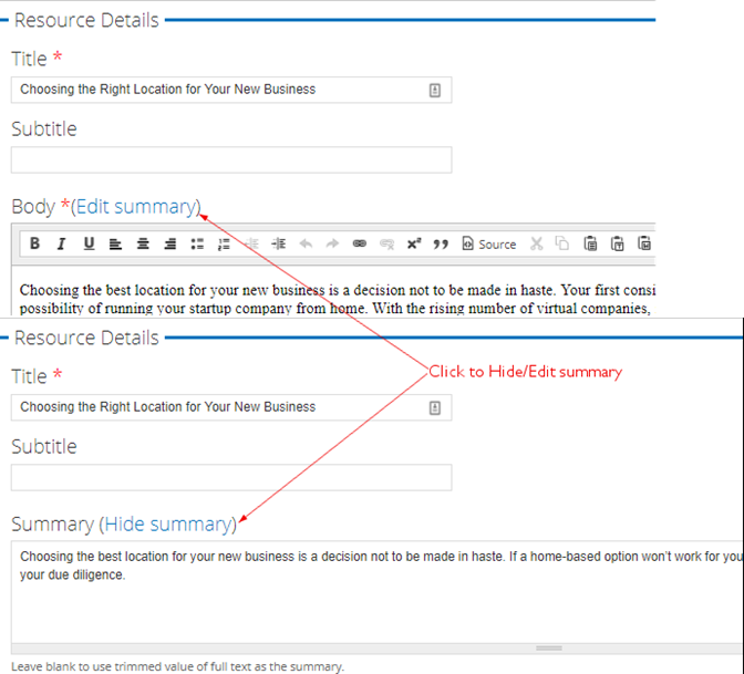
Figure 3‑2 - Summary configuration
When adding an image, the title and alternative title should always be completed. This text describes the image for search engines, end users and for handicap accessibility tools.
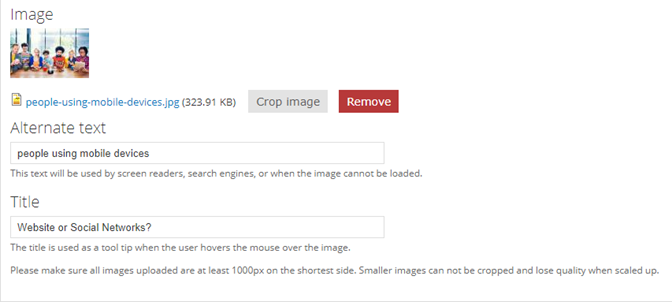
Figure 3‑3 - Image configuration
3.3.1.3 Vocabularies:
When selecting vocabularies, it’s important to think of the user experience. Where should users find this information?
- Topics: The rule to follow is that the business topics should align with the main idea of the content. Please select all topics that apply and make sense given the title and content themes.
- Business Stage: For business stages, select both pre-start and in business unless the content speaks only to one specific business stage.
- Industries & Entrepreneur Types: For both industries and entrepreneur types, it is recommend that you only selecting those vocabularies that the content speaks specifically to for an audience.
- Sponsor: You must first add the sponsor to the site before it will appear in the list to be associated with content. Please see the Sponsors section for more information.
3.3.2 General Page Options
3.3.2.1 URL Path Settings:
This determines the URL for the page. The default setting includes a prefix based on content type (i.e. event/ or resource/) and the page title separated by hyphens. The only time you should uncheck the box to generate the auto alias is if punctuation appears in the URL or need to manually override this to create a specific URL.
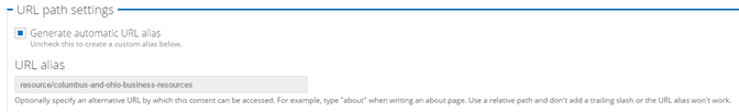
Figure 3‑4 - URL path configuration
3.3.2.2 Meta Tags
Meta Tags are important for Search Engine Optimization and should be reviewed/modified for every node created. There are default settings in place for the meta page title and description. They reference the page title you entered when creating the page and the summary entered with the body of the page. You can override these as needed.
You can also fill in a page abstract to be used by search engines.
We do not recommend using the keywords field as this is no longer supported by search engines.
There is also a section to add more advanced tags. Expand this section to review more options.
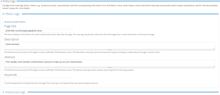
Figure 3‑5 - Meta tag configuration
3.3.2.3 Revision information
This should be used to provide an explanation to other webmasters about why changes were made to a page.
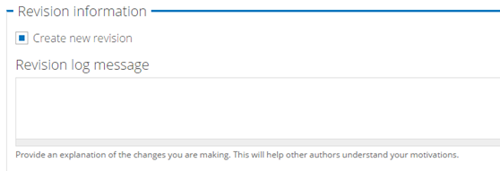
Figure 3‑6 - Revision configuration
3.3.2.4 Authoring Information
This information is filled out by default and lists the date and time a node was created and the author of the node.
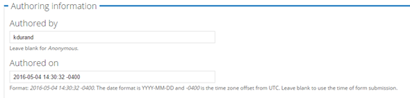
Figure 3‑7 - Authoring configuration
3.3.2.5 Publishing options
This should be used if you need to remove a node from the site. You can uncheck the “Published” box to remove a page from publication. Unchecking the “Published” box does not delete the content, only removes it from public view.
You can also use this section to make a piece of content “Sticky at the top of lists”. That means if it appears in a search list, it will always appear at the top. This is not recommended as it reduces the accuracy of keyword search results and always display the content at the top of the list even if it’s not highly relevant to a user search.
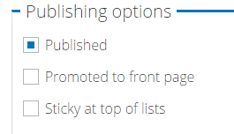
Figure 3‑8 - Publishing configuration
3.4 Author Profile
The Author Profile provides information about the Author or Presenter and is referenced by Events, Blogs and Resources. When associated with one of these content types, a brief author bio will appear to site visitors and links to the full Author Profile containing a more robust profile and links to all the other content that Author has contributed to the site.
3.4.1 Author Name Tab
Author Name: Fill in the Prefix, First Name, Middle Name, Last Name, and Suffix Fields. This information populates the page heading, breadcrumb and URL for the author page.
Prefix: (Optional) Fill in the Prefix as applicable, e.g., Dr. Ms. Mr. Mrs. or Miss. If entered, this must be used when searching for the author on the site.
First Name (Required)
Middle Name or Initial (Optional)
Last Name (Optional)
Suffix- e.g., Sr. Jr. III or Esq. (Optional)
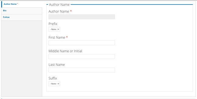
Figure 3‑9 - Author configuration
3.4.2 Bio Tab
Author Job Title: Text field to enter the Author’s Job Title
Author Image: File upload for the Author’s headshot image. This will show on the node and its teasers.
Please make sure that all images uploaded are at least 1000px on the shortest side. Smaller images cannot be cropped and lose quality when increased in size.
Allowed file types: png, gif, jpg, or jpeg.
Business or Company Name: Free text field to enter the Author’s Business or Company
Body: WYSIWYG Text Area to enter the biographical details for this author.
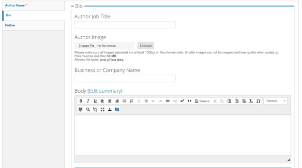
Figure 3‑10 - Author bio information
3.4.3 Follow Tab
3.4.3.1 Twitter:
Title: Use the Twitter Username here, e.g. @username
URL: Enter the Twitter URL, e.g., www.twitter.com/username
3.4.3.2 LinkedIn:
Title: Use the LinkedIn Username here, e.g. joesmith
URL: Enter the LinkedIn URL, e.g., www.linkedin.com/joesmith
3.4.3.3 Facebook:
Title: Use the Facebook Username here, e.g. joesmith
URL: Enter the Facebook URL, e.g., www.facebook.com/joesmith
3.4.3.4 Website:
Text Field: Enter the URL of the website as you want it displayed, e.g. http://www.example.com
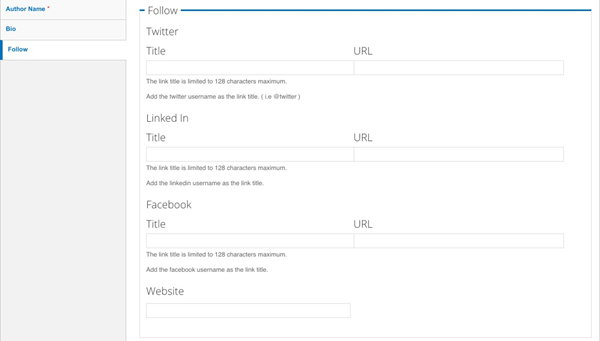
Figure 3‑11 - Author follow configuration
3.5 Basic Page
The Basic Page is a flexible content type, used to create pages that do not require highly structure content elements, e.g.: “About Us”. The Basic Page is comprised of the following fields:
Title: Text Field for the Page Title. Populates the page heading, breadcrumb and URL. Appears as link name when content is referenced on the site.
Summary: The plain text summary that appears in teasers. This limited to 180 characters. If no Summary is entered, then the first 180 characters of the body field is displayed.
Body: WYSIWYG-enabled text area to enter in content. Refer to “WYSIWYG Details” section to understand what the WYSIWYG elements are.
3.5.1 Hero Block Tab
The Hero Block is composed of image and description that appear at the top of the page. It is a prominently displayed section with a visually striking image and texts supported via the WYSIWYG.
Featured Image: File upload for the Hero Image. Files must be less than 50 MB.
Allowed file types: png, gif, jpg, or jpeg.
These are meant to be fluid images that scale and grow with the page. They, however, are not associated with the aspect ratios used for other images on the site.
Subtitle: (Optional) Displays in the text area that accompanies the hero image.
Description: Appears beneath the optional subtitle. There is a WYSIWYG to enter text to supplement the featured image. See Hero WYSIWYG Section.
Background Color: The default background color behind the Subtitle + Description is grey, if desired, change the background to green by selecting the drop-down to “green.”
Links: This is for an optional “Call to Action” button to be placed at the bottom of the Hero Block.
Title: In the “Title” field, enter the text to display to the user.
URL: In this field enter the relative path to your page; e.g. “contact-us”. DO NOT type the full URL in the field if it is an INTERNAL link.
Only if you wish to link to an external page, then enter the full URL, such as http://www.example.com.
Open in a New Window: (Optional) select box, to allow the link to open in a new window rather than replace the current page the visitor is viewing. Used this primarily for External Links.
See Linking content Section
Add Another Item: Click this button if you want to add more links. The page will refresh to display another “Title” field, “URL” field and “Open in a new window” checkbox, which you may complete using the instructions above. If the fields in the new item are left blank no additional links will appear on the page.
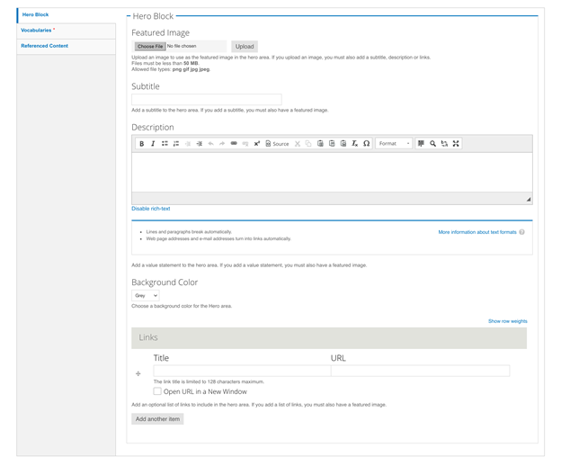
Figure 3‑12 - Hero Block configuration
3.5.2 Vocabularies Tab
Selections on this tab must be made so that the content can be properly delivered to users and assist in narrowing their content searches and results according to these criteria.
Topics: Select one or many Topics that apply to this node
Business Stage: (Optional) Select one or many Business Stages that apply to this node
Entrepreneur Type: (Optional) Select one or many Entrepreneur Types that apply to this node
Industries: (Optional) Select one or many Industry types that apply to this node
Sponsor: If the page is sponsored, select the appropriate sponsor from the drop-down list. The Sponsor Information will display below the page body. See Sponsors Section
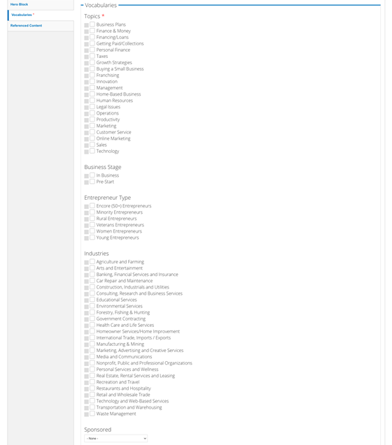
Figure 3‑13 - Vocabularies configuration
3.5.3 Referenced Content Tab
You may select content that you want to have appear as “related content” on the page.
- Related Content Title: (Optional) Enter a new title to replace the default “Related Content” text above the referenced nodes.
- Related Content Node Reference: This is allows you to lookup existing content in the system; begin typing the first few letters of the node title to reveal a drop-down of possible matches for your selection. There can be a maximum of two Related Content nodes on the Page.
- Upcoming Events Title: (Optional) Enter a new title to replace the default “Upcoming Events” text above the referenced event nodes.
- Upcoming Event Node Reference: This is allows you to lookup existing content in the system; begin typing the first few letters of the node title to reveal a drop-down of possible matches for your selection. There can be a maximum of two Event Related Content nodes on this Page.
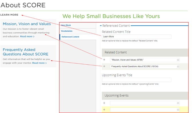
Figure 3-14 Related content and configuration
3.6 Blog Post
This content type is used to create blog posts. Blogs appear on the “Browse Library” Landing page.
Title: Text Field for the Page Title. Populates the page heading, breadcrumb and URL. Appears as link name when content is referenced on the site.
3.6.1 Content Tab
Featured Image: File upload for the Blog’s associated image. This will show on the node and its teasers.
Please make sure that all images uploaded are at least 1000px on the shortest side. Smaller images cannot be cropped and lose quality when increased in size.
Files must be less than 50 MB.
Allowed file types: png, gif, jpg, or jpeg.
Summary: The plain text summary that appears in teasers. This limited to 180 characters. If no Summary is entered then the first 180 characters of the body field is displayed.
Body: WYSIWYG-enabled text area to enter in content. Refer to “WYSIWYG Details” section to understand what the WYSIWYG elements are.
Author: Node Reference for an existing author in the system. Type in the first few letters of the Author’s name to reveal a drop-down of matching results for your selection.
Sponsored: If the blog is sponsored, select the appropriate sponsor from the drop-down list. The Sponsor Information will display below the page body. See Sponsors Section
Related Content Title: (Optional) Enter a new title to replace the default “Related Content” text above the referenced nodes.
Related Content Node Reference: This is allows you to lookup existing content in the system; begin typing the first few letters of the node title to reveal a drop-down of possible matches for your selection.
There can be a maximum of two Related Content nodes on this Page.
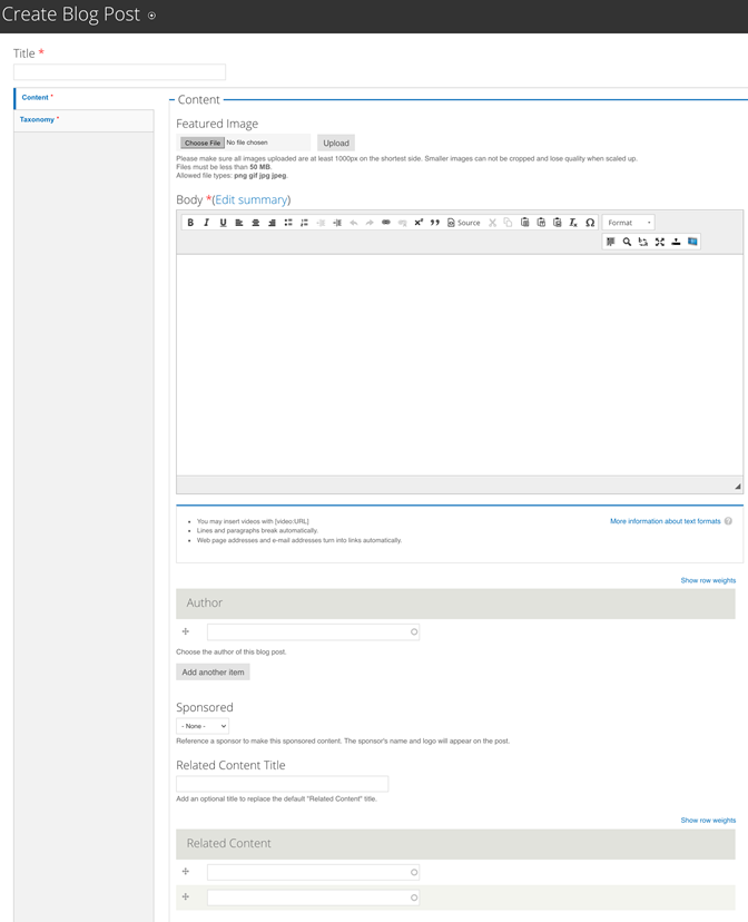
Figure 3‑15 - Content creation configuration
You must make selections on this tab so that the content can be properly delivered to users who want to narrow their content searches and results according to these criteria.
3.6.2 Taxonomy Tab
Topics: (Required) Select one or many Topics that apply to this Blog node
Business Stage: (Optional) Select one or many Business Stages that apply to this Blog node
Entrepreneur Type: (Optional) Select one or many Entrepreneur Types that apply to this Blog node
Industries: (Optional) Select one or many Industry types that apply to this Blog node
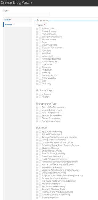
Figure 3‑16 - Taxonomy configuration
3.7 Branch
Branches are created in CORE and relevant data is synced regularly with the website’s database. See Editing a Branch Section for more information.
3.8 Chapter
Chapters are created in CORE and relevant data is synced regularly with the website’s database. See Editing a Chapter Section for more information.
3.9 Event
The Event content type is used to create online, in-person and recorded events, workshops and courses. The available event types are detailed in the following pages.
3.9.1 Local Event
Local Events are used to display workshops, networking functions and other events hosted by SCORE chapters. They are created at the Chapter level, but appear on both the Chapter and the National Sites. The display is configured to highlight time and location. The “Register Now” button is populated by the “Registration Link” field and should take user to the appropriate registration page. Chapter webmasters can create events manually or by Syncing Local Events from Constant Contact.
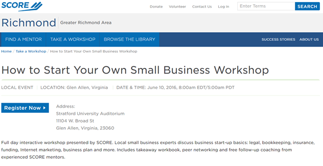
Figure 3‑17 - Local event display
3.9.2 National Event
National Events are created by SCORE staff for national workshops or events such as SCORE Awards, Virtual Conferences, etc. They have the same functionality yet are generated from the national site.
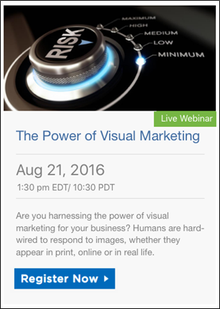
3.9.3 Live Webinar
Live Webinars is the categorization for Events hosted virtually. The “Register Now” button is populated by the “Registration Link” field and should take user to a 3rd party registration option.
3.9.4
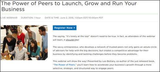
Figure 3‑18 - Live Webinar display
3.9.4 Recorded Webinar
Recorded Webinars are recordings of live webinars. Once a recording is available, convert the Live Webinar to a Recorded Webinar via the “Event Type” Vocabulary described below. For clarity the date, time and registration link fields should be cleared. The recording should be added to the relevant field based on the format of the recording. Once converted the “Register Now” button will take users to the Event registration web form on your site.
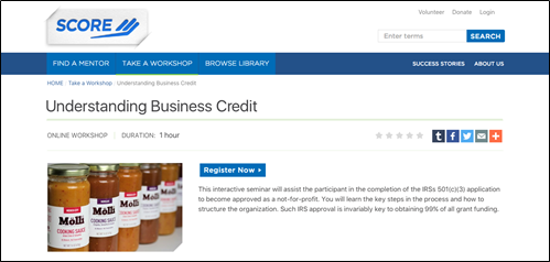
Figure 3‑19 - Recorded Webinar display
3.9.5 Course on Demand
Courses on Demand are similar to the Recorded Webinar in regards to how they are created in the administration of the site. The web course should be added to the relevant link field based on the format. The “Register Now” button will take users to the Event registration webform on your site.
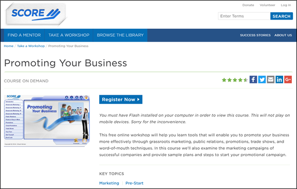
Figure 3‑20 - Course on Demand display
3.9.6 Event Details Tab
Title: The page title text field populates the page heading, breadcrumb and URL. The title also appears as link text when content is referenced on the site.
Subtitle: (Optional) Appears beneath the Title on the node. Does not appear in teasers.
Summary: The plain text summary that appears in teasers. This limited to 180 characters. If no Summary is entered then the first 180 characters of the body field is displayed in the teaser.
Body: WYSIWYG-enabled text area to enter in content. Refer to “WYSIWYG Details” section to understand what the WYSIWYG elements are.
Image: (Optional) This image will show on the node and its teasers. Please make sure that all images uploaded are at least 700px on the shortest side. Smaller images cannot be cropped and lose quality when increased in size.
Files must be less than 50 MB.
Allowed file types: png, gif, jpg, or jpeg.
Duration: (Optional) Free text field describing how long the event lasts. Enter as “minutes: seconds” “hour: minutes” or “1 hour”
Registration Link: This should only be used with live events. Enter the external URL to your third party registration. This field should be blank for Recorded Webinars and Courses that use the SCORE CMS registration form. See Linking content section
Video Link: Used for Video Recordings in .MP4 and .FLA format. Use the full / absolute URL, not the relative path. See Linking content section
YouTube Video/Video URL: Used for Video Recordings hosted on YouTube. Use the full / absolute URL, not the relative path. See Linking content section
Presentation Link: Used for Video Recordings where presentation link ends in .html or .swf. Use the full / absolute URL, not the relative path. See Linking content section
Presentation Width: Enter the width of the iframe for the presentation URL in pixels. Recommended width is 800. This will only be used with the presentation URL.
Presentation Height: Enter the height of the iframe for the presentation URL in pixels. Recommended width is 490. This will only be used with the presentation URL.
Short Description: Do Not Enter Text Here
This description is synced from Constant Contact for Local Workshops and should not be used for other Event Types. If the body is not completed, the value of this field will be used instead.
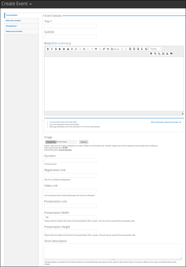
Figure 3‑21 - Create event configuration
The following fields are optional as the only apply to Local Events, National Events, and Live Webinars.
3.9.7 Date and Location Tab
Show End Date checkbox: If it is a timed end to the event, provide an end to the Event.
Date: (Required for all live events) Enter the start date of the Event.
End Date: (optional) Enter the date that the event ends. We do not recommend scheduling events that last longer than 1 month.
For events that are given in a series and offered multiple times over a period of one month or longer, we recommend creating individual events for each session. This will improve the way the events are displayed on the “Take a Workshop” page. Otherwise, events will appear outdated on your website since only the start date is displayed on the “Take a Workshop” page.
Time: (Optional – required for all live events) Enter hours: minutes as the event “start” time.
Time zone: Drop-down to select the time zone for this Event.
Location Name: (Optional – required for all in-person events) A description of the Location name, such as “XYZ Chamber of Commerce”
Address 1: Text Field for first address line
Address 2: Text Field for second address line
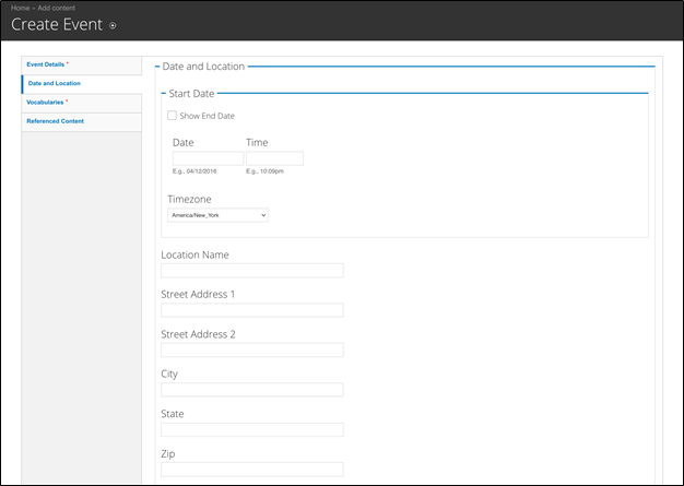
Figure 3‑22 - Create Event date and location configuration
City, State, Zip: Enter in applicable details.
3.9.8 Vocabularies Tab
Event Type: (Required) The Event Type is critical to ensure the correct fields are displaying to end-users and the content behaves properly. Choose from the following options described in the preceding pages:
- National Event (not available for chapters)
- Live Webinar
- Recorded Webinar
- Local Event
- Course on Demand
Topics: (Required) Select one or more Topics that apply to this node. Do not select all topics; we recommend only selecting those that are related to the main idea of the content.
Business Stage (Optional) Select one or more Business Stages that apply to this node.
Entrepreneur Type (Optional) Select one or more Entrepreneur Types that apply to this node. We recommend only selecting those that apply to the content.
For example, a workshop about starting a business in your area might be useful for any entrepreneur type, but you should not select one for a more general event. However, if you have a workshop geared towards veteran business owners, you would select the “Veteran Entrepreneurs” type as the content speaks directly to that audience.
Sponsor: If the event is sponsored, select the appropriate sponsor from the drop-down list. The Sponsor Information will display below the page body. See Sponsors Section
Industries: (Optional) Select one or more Industry types that apply to this node. Only select an industry if the content speaks specifically to that group.
For example, a business plan workshop would be helpful for business owners in any industry. But a business plan workshop for retail businesses speaks specifically to the retail audiences, so you would select that industry vocabulary term for that event.
3.9.9 Referenced Content Tab
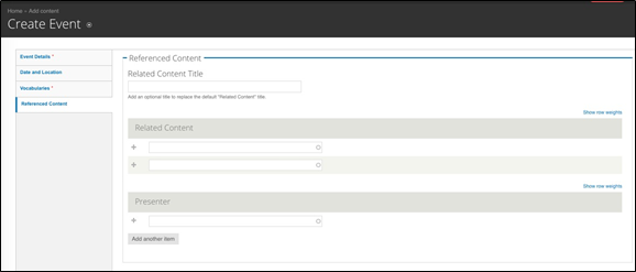
Figure 3‑23 - Create Event Referenced Content configuration
You may select content that you want to have appear as “related content” on the page.
Related Content Title: (Optional) Enter a new title to replace the default “Related Content” text above the referenced nodes.
Related Content Node Reference: This is allows you to lookup existing content in the system; begin typing the first few letters of the node title to reveal a drop-down of possible matches for your selection.
There can be a maximum of two Related Content nodes on this Page.
Presenter: To associate a presenter with a workshop, you must first create an author profile. See the Author Profile section of this guide to learn how to create an author.
Once the author profile has been created, you can return to this page and add them as a presenter. Move to the presenter field. Begin typing the first few letters of the author’s name to select them from the drop-down list of matches. This will add them as a presenter on the event.
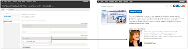
Figure 3‑24 - Presenter configuration and display
Presenter: Node lookup for author profile. Begin typing the first few letters of an author’s name to select from the drop-down list of matches and then associate as a Presenter.
3.9.10 How to Add the Constant Contact Event Widget
Another way to list your local events is to use the Constant Contact widget. You can find the Constant Contact widget code in one of your events in Constant Contact.
- Log in to Constant Contact.
- Click on Campaigns.
- Click on one of the events. Make sure you’re viewing the event dashboard tab.
- Scroll to the bottom of the page to the events calendar section. On the right side, you’ll see a link that says “Attend my Events Widget”. Click this link.
- Click the blue triangle next to the “add widget” link to configure the widget settings.
- Once you’ve set up the widget the way you want it to appear, copy the widget source code. This is the code you’ll place in the WYSIWYG description field (or page body) on your website.
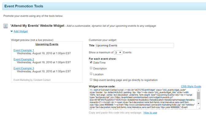
7. On your chapter website, navigate to the Take a Workshop landing page (or any basic page or landing page where you want the widget to appear).
8. Click edit. Click on the content bands tab on the left side of the page.
9. Add a WYSIWYG Only content band to the page. You can place this band wherever you want on the page.
10. In the description field, click the Source icon in the menu.
11. Enter the Constant Contact widget code into the source code of the field. Save the page.
3.10 Headline
The headline content type is used for the creation of “Press Releases” and “In the News” items.
3.10.1 Headline Details Tab
Title: Text Field for the page Title. Populates the page heading, breadcrumb and URL. Appears as link text when content is referenced on the site.
Subtitle: (Optional) Subtitle that appears beneath the Headline.
Headline Date: The calendar date that the Headline was posted in MM/DD/YY
Headline Type: Taxonomy Select from the Headline Vocabulary, e.g., “In the News”
Image: This will show on the node and its teasers. Please make sure that all images uploaded are at least 1000px on the shortest side. Smaller images cannot be cropped and lose quality when increased in size.
Allowed file types: png, gif, jpg, or jpeg.
Summary: The plain text summary that appears in teasers. This limited to 180 characters. If no Summary is entered then the first 180 characters of the body field is displayed.
Body: WYSIWYG-enabled text area to enter in content. Refer to “WYSIWYG Details” section to understand what the WYSIWYG elements are.
3.10.2 Source Tab
Source: Pick a term from the Source drop-down list so that the source’s logo can be displayed on the page.
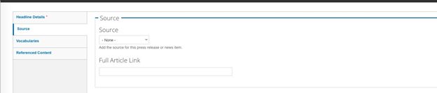
Figure 3‑25 - Source tab configuration
Full Article URL: Enter the full article url so that the visitor can read the full article.
3.10.3 Vocabularies Tab:
You must make selections on this tab so that the content can be properly delivered to users who want to narrow their content searches and results according to these criteria.
Topics: (Required) Select one or many Topics that apply to this Blog node
Business Stage (Optional) Select one or many Business Stages that apply to this Blog node
Entrepreneur Type (Optional) Select one or many Entrepreneur Types that apply to this Blog node
Industries: (Optional) Select one or many Industry types that apply to this Blog node
3.10.4 Referenced Content Tab
You may select content that you want to have appear as “related content” on the page.
Related Content Title: (Optional) enter a new title to replace the default “Related Content” text above the referenced nodes.
Related Content Node Reference: This is allows you to lookup existing content in the system; begin typing the first few letters of the node title to reveal a drop-down of possible matches for your selection.
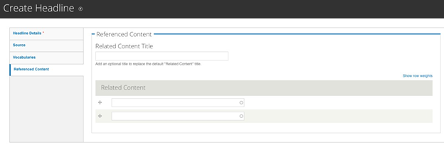
Figure 3‑26 - Headline Referenced Contacts configuration
There can be a maximum of two Related Content nodes on this Page.
3.11 Landing Page
3.11.1 The Hero Block Tab
This is the Image AND a description that appears at the top of the page. It is a prominently displayed section with a visually striking image and texts supported via the WYSIWYG.
Featured Image: File upload for the Hero Image. Files must be less than 50 MB. Allowed file types: png, gif, jpg, or jpeg. These are meant to be “fluid images” that scale and grow with the page. They are not associated with the aspect ratios used for other images on the site.
Subtitle: (Optional) Displays in the text area that accompanies the hero image.
Description: Appears beneath the optional subtitle. There is a WYSIWYG to enter text to supplement the featured image. See Hero WYSIWYG Section.
Background Color: The default background color behind the Subtitle + Description is grey, if desired, change the background to green by selecting the drop-down to “green.”
Links: This is for an optional “Call to Action” button to be placed at the bottom of the Hero Block.
Title: In the Title field, enter the text to display to the user.
URL: In the URL field, enter the relative path to your page; e.g. “contact-us”. DO NOT type the full URL in the field if it is an INTERNAL link. If wish to link to an external page, then enter the full URL, such as http://www.example.com.
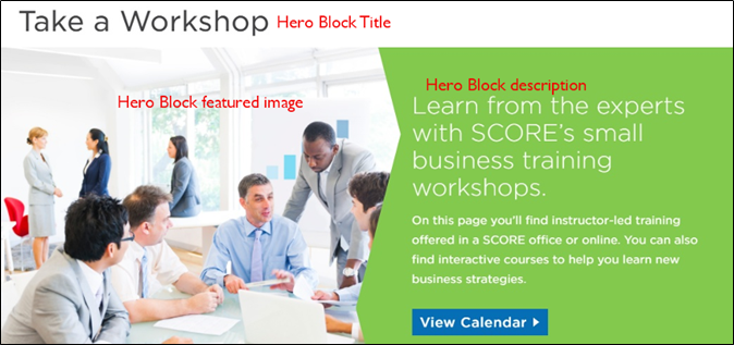
Figure 3‑27 - Hero Block display
Open in a New Window (Optional) select box, to allow the link to open in a new window rather than replace the current page the visitor is viewing. Used for External Links. See Linking Content section.
Add Another Item:
Click this button if you want to add more links. The page will refresh to display another “Title” field, “URL” field and “Open in a new window” checkbox, which you may complete using the instructions above.
3.11.2 Content Band Tab: Working with Content Bands
A Content Band is an editorially controlled block of content available only on Landing Pages and Chapters. It is best described as a predefined presentation of content, enabling content editors to layout and present content in a flexible yet consistent manner.
The Content Bands are meant to be manually curated, and can be edited, added or removed from the Landing page by any user with content-editing access.
There are six content bands that provide different functionality and presentation options; details and screenshots of the bands can be found below:
3.11.2.1 Add a Content Band
Adding a Content Band is made possible through a section on the content node, accessible from the sidebar shortcuts:
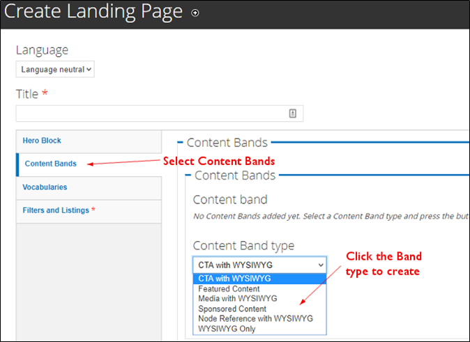
Figure 3‑28 - Content Band create configuration
Based on the Content Item that you selected, follow the steps for each type below:
3.11.2.2 Featured Content Band
This band is used to draw attention to important pages on the site. It is meant to display only node references. The display is optimized for three blocks of content but two will work as well. If you only have one node to feature we recommend using the Media with WYSIWYG or Node Reference with WYSIWYG bands instead.
Select the three nodes that should be displayed in this band of content. Type in the first few letters of the node’s title and a drop-down of possible matches will appear for your selection.
The display of these Featured nodes automatically pulls from the node’s title, summary field, term, and Featured Image Upload field. When the node does not have a featured image, no image will display.
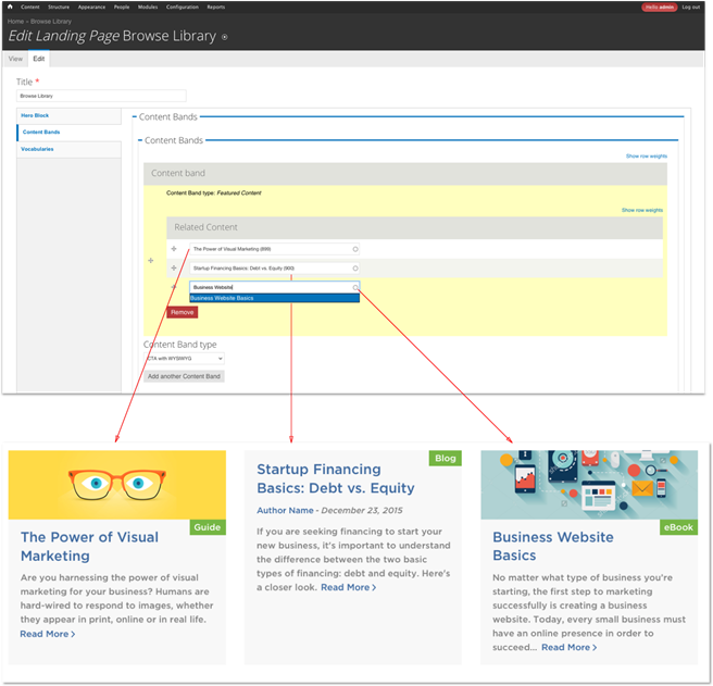
Figure 3‑29 - Hero Block Content Bands configuration and display
3.11.2.3 Media with WYSIWYG
Used to emphasis messaging with video or large imagery. Allows for Direct upload of Image/Audio/Video with a WYSIWYG for text description and the ability to add a custom Call to Action button.
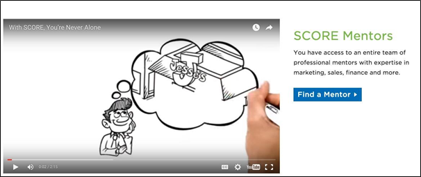
Figure 3‑30 - Media (video) with WYSIWYG display

Figure 3‑31 - Media (image) with WYSIWYG display
3.11.2.4 Node Reference with WYSIWYG Band
Used to enhance presentation of a single piece of featured content. Ability to reference a node for teaser display on one side of the band, with a WYSIWYG for further description on the other side of the band.
This band is especially useful when highlighting Mentors and Success Stories
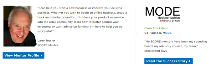
Figure 3‑32 – Node reference with WYSIWYG display (small node reference on right)
3.11.2.5 CTAs with WYSIWYG Band
These are the Blue, Green, and Grey Boxes that can be found on the Landing pages as stylistic call-outs used to emphasize key actions and messaging on the site. The display is optimized for three blocks of content but two will work as well. If you only have a single message and Call to Action we recommend using the Media with WYSIWYG instead.
Also referred to as “Mini CTA’s,” these are the three blocks that have text and a call-to-action button.
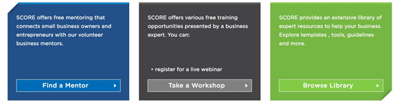
Figure 3‑33 - Call to Action display
Allows for full customization, but loses the benefit of the structure design output by the other bands.
3.11.2.6 One Large WYSIWYG
This is ideal if you still want to use the “upcoming events” Constant Contact widget or if you want more control over the placement of text and images.
3.11.2.7 Sponsor Content Band
If the page is sponsored, choosing the Sponsor Content Band will allow for the selection of the appropriate sponsor from the drop-down list. The Sponsor Information will display as it does on other Content pages.
Figure 3‑34 - Sponsor Content Band display
3.11.3 Configuring the Masonry Listings
The Landing Pages have a "section" of content beneath search filters. Landing Pages, such as "Browse Library" featuring Resource Content nodes and Blog Content nodes with a range of vocabulary terms.
A Landing Page such as “Growth Strategies” may feature all Blogs, Resources, Events, Success Stories, and Press Releases that a user can sort through.
This section is generated when a content creator selects the “parameters” on the “Vocabularies” and “Filters and Listings” tabs within the node edit view of the Landing Page. These parameters determine what content should be displayed to the site visitor.
3.11.3.1 Vocabularies Tab
By selecting the Vocabulary, the Content Creator is defining the content available of this Landing Page’s listing on page load, such as “Growth & Strategies.”
Important Note:
You can select only one term from each of the Vocabularies. While you can or select one term in multiple vocabularies it is not recommended as it provides a very limited content set.
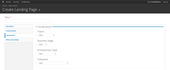
Figure 3‑35 - Landing Page configuration
3.11.3.2 Filters and Listings Tab
The next step is determining whether or not to show listings and establishing which “Types” of content should be displayed on this Landing Page.
First, check the “Show Listings” checkbox to filter and display specific content to the user. You can determine what kind of content you want to display on this landing page by selecting the “Type”. Don’t let the “type” name confuse you; these are the formats available within all the content types on your website.
|
|
|
|
|
|
|
|
|
|
|
|
|
|
|
|
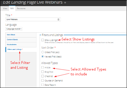
Figure 3‑36 - Filter and Listings configuration
3.12 Mentor Profile
This is not an editable content in the Drupal CMS. Please update the Mentor Details in CORE, where there will be updates to Drupal every 30 minutes.
3.13 Resource
3.13.1 Resource Details Tab
Title: Text Field for the Page Title. Populates the page heading, breadcrumb and URL. Appears as link name when content is referenced on the site.
Subtitle: Text that appears beneath the Title
Summary: The plain text summary that appears in teasers. This limited to 180 characters. If no Summary is entered then the first 180 characters of the body field is displayed.
Body: WYSIWYG-enabled text area to enter in content. Refer to “WYSIWYG Details” section to understand what the WYSIWYG elements are.
Image: (Optional) Primary Image for the Resource. This will show on the node and its teasers. Please make sure that all images uploaded are at least 1000px on the shortest side. Smaller images cannot be cropped and lose quality when increased in size. Files must be less than 50 MB. Allowed file types: png, gif, jpg, or jpeg.
3.13.2 Call to Action Tab
Button Label Select: Select the type of download from the drop-down list; this NOT the same as the Resource format, rather it is meant to characterize the type of File being downloaded.
Upload Attachment: File Upload; Limit is 50 MB. Uploading a file will override a Link to a resource.
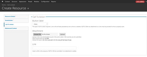
Figure 3‑37 - Call to Action configuration
Link (if no attachment): Link to a resource file – upload the URL.
3.13.3 Referenced Content Tab
You may select content that you want to have appear as “related content” on the page.
Author: Node reference for an existing author in the system. Type in the first few letters of the Author’s name to reveal a drop-down of matching results for your selection.
Related Content Title: (Optional) replaces the default “Related Content” text above the referenced nodes.
Related Content Node Reference: This is allows you to lookup existing content in the system; begin typing the first few letters of the node title to reveal a drop-down of possible matches for your selection.
There can be a maximum of two Related Content nodes on this Page.
3.13.4 Vocabularies Tab
You must make selections on this tab so that the content can be properly delivered to users who want to narrow their content searches and results according to these criteria.
Topics: (Required) Select one or many Topics that apply to this Blog node
Business Stage (Optional) Select one or many Business Stages that apply to this Blog node
Entrepreneur Type (Optional) Select one or many Entrepreneur Types that apply to this Blog node
Industries: (Optional) Select one or many Industry types that apply to this Blog node
Sponsor: If the resource is sponsored, select the appropriate sponsor from the drop-down list. The Sponsor Information will display below the page body. See Sponsors Section
3.14 Success Story
Title: Title of the Success Story that appears at the top of the page.
3.14.1 Company Information Tab
How Did Your Business Get Started?
WYSIWYG Text Area
Client Name: Text field to enter in the name of the person that this Success Story features.
Client Title / Role: Text field to enter this Client’s role in their business – e.g., Owner, Founder
Client Photo: Primary Image for the Client. Please make sure all images uploaded are at least 1000px on the shortest side. Smaller images cannot be cropped and lose quality when scaled up. Files must be less than 50 MB.
Allowed file types: png, gif, jpg, or jpeg.
Company Name: (Required) Text Field for typing in the name of the company
Business Logo: Upload the logo for the business associated with this Client. Please make sure all images uploaded are at least 1000px on the shortest side. Smaller images cannot be cropped and lose quality when scaled up. Files must be less than 50 MB. Allowed file types: png, gif, jpg, or jpeg.
Number of Employees: Enter the number of Employees in this Client’s business. (text field)
Year Company Formed: Text field to enter in the year that this company was formed.
Location: (Optional)
Street
City
State
Postal Code
Latitude / Longitude (Optional)
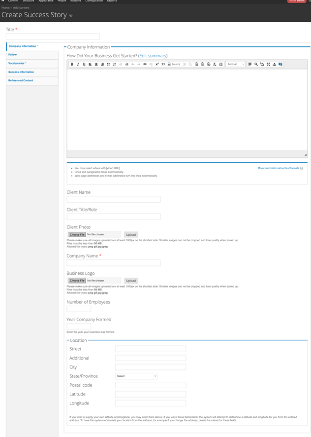
Figure 3‑38 - Create Success Story Company Information configuration
3.14.2 Follow Tab
Twitter:
Title: Use the Twitter Username here, e.g. @username
URL: Enter the Twitter URL, e.g., www.twitter.com/username
LinkedIn:
Title: Use the LinkedIn Username here, e.g. joesmith
URL: Enter the LinkedIn URL, e.g., www.linkedin.com/joesmith
Facebook:
Title: Use the Facebook Username here, e.g. joesmith
URL: Enter the Facebook URL, e.g., www.facebook.com/joesmith
Website:
Text Field: Enter the URL of the website as you want it displayed., e.g. http://www.example.com
3.14.3 Vocabularies Tab
You must make selections on this tab so that the content can be properly delivered to users who want to narrow their content searches and results according to these criteria.
Topics: (Required) Select one or many Topics that apply to this Blog node
Business Stage (Optional) Select one or many Business Stages that apply to this Blog node
Entrepreneur Type (Optional) Select one or many Entrepreneur Types that apply to this Blog node
Industries: (Optional) Select one or many Industry types that apply to this Blog node
3.14.4 Success Information Tab
My Successes: Text area for entering in details – there is no WYSIWYG option, just plain text.
Video: (Optional) add a YouTube or Vimeo Video URL to display with this Success Story.
How SCORE Helped: Enter plain text information about how SCORE helped this client.
What’s Great About my Mentor: Enter plain text content for how this client’s Mentor was an instrumental part of this Success.
Mentor: Associate the Mentor Profile by typing in the first few letters of the Mentor to reveal a drop-down for optional matches for
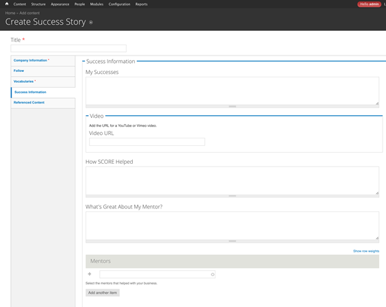
Figure 3‑39 - Create Success Story Success Information configuration
Related Content Title: (Optional) enter a new title to replace the default “Related Content” text above the referenced nodes.
3.14.5 Referenced Content Tab
Related Content Node Reference: This is a node lookup of existing content in the system; begin typing the first few letters of the node title to reveal a drop-down of possible matches for your selection.
There can be a maximum of two Related Content nodes on this Page.
3.15 Working with the WYSIWYG
The WYSIWYG (“What You See Is What You Get”) editors enables you to add formatting to your content, such as bullets, hyperlinks, alignment, and quotes.
The CMS is using CKeditor as its WYSIWYG editor with three distinct filters:
3.15.1 Body WYSIWYG
Used on the Body field on all content types. This is a WYSIWYG enabled (default) format, with a source code option for authorized roles who wish to compose text directly using HTML.
3.15.2 Hero WYSIWYG
Used on the Hero field and the CTA with WYSIWYG Content Band. Options are significantly limited compared to Body.
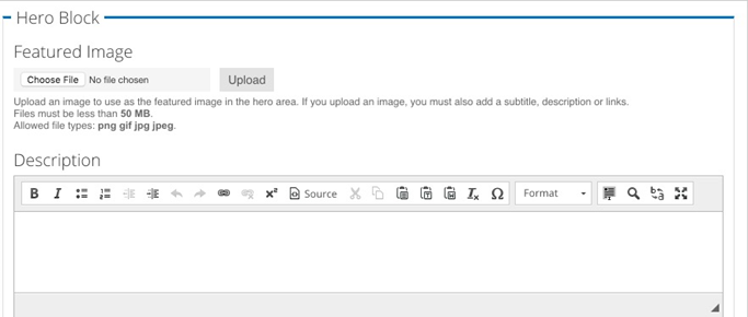
Figure 3‑40 - Hero Block WYSIWYG configuration
This is a WYSIWYG enabled (default) format, with a source code option for authorized roles who wish to compose text directly using HTML.
3.15.3 Content Band WYSIWYG
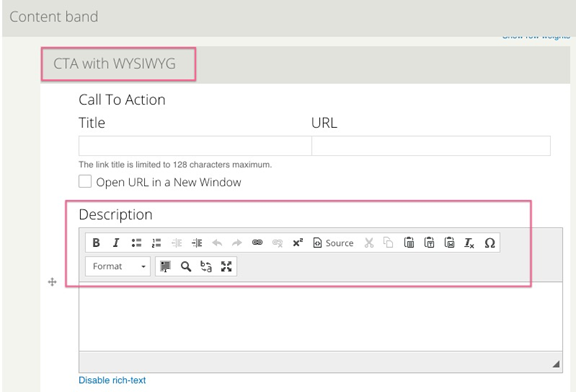
Figure 3‑41 - Call to Action WYSIWYG
This is a WYSIWYG enabled (default) format, with a source code option for those who wish to use HTML.
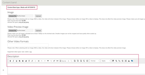
Figure 3‑42 - Call to Action configuration
3.15.4 Formatting Options
Along the top of the WYSIWYG field is a series of buttons that provide options formatting.
3.15.4.1 Paragraph Options
Formatting is used to organize and structure content.
You can add a number of different types of headings. They range in number from 2 (being the highest) to 4 (being the lowest). The higher the heading is, the more “important” the content is to not only Search Engines but also a user of a screen reader.
Use of the different headings is for structure and supports a consistent presentation WYSIWYG.
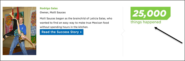
3.15.4.2 Styles
The “Impact Stat” is for the little “statistic” that often accompanies a success story. It is recommended for use on the Node Reference with WYSIWYG:
3.15.4.3 Image / File Upload
Available on all WYSIWYG body fields except for the following:
- CTA with WYSIWYG
- Hero Description
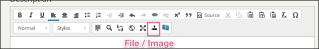
Figure 3‑43 - WYSIWYG file upload button
Double click the file or image that has been placed in the WYSIWYG to call up the Image Properties for further adjustment such as size, positioning and text alignment.
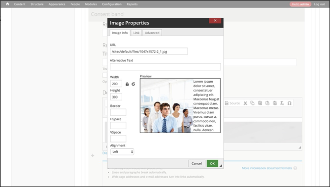
Figure 3‑44 - WYSIWYG image properties
3.15.4.4 Insert Video/Audio
This field allows Content Editors to insert YouTube or Vimeo files into their body content.
3.15.4.4.1 Getting URLs from SoundCloud
In order to have audio play directly in page you need the URL in the proper format. To get this format follow the following instructions:
- Go to the podcast page e.g;com/scorementors/generational-characteristics-of-the-workplace
- Click Share
- The click Embed, and check "Wordpress Code". The code generated will have extraneous information you do not need.
- Copy just the URL from the code string.
This is the URL you will post in the link field e.g.; https://api.soundcloud.com/tracks/229802794
3.16 Image Cropping
Image cropping is in place to help control layout and presentation of the images.
Image cropping is not available when images are uploaded through the WYSIWYG. The Image Crop is available in the following Image locations:
|
|
It is advisable to upload images that are longer / taller than 1000pixels on the shortest side to prevent up-scaling, which creates pixelated or blurry images.
Images can be cropped to the following aspect ratios:
3.16.1.1 4:3 Ratio
The 4:3 Ratio is primarily used for displaying the featured image on the node, when that image is uploaded in landscape format. Another use is for Sponsor Logos.
3.16.1.2 3:4 Ratio
The 3:4 Ratio is used for displaying the featured image when that image is uploaded in portrait format.
3.16.1.3 2:1 Ratio
The 2:1 Ratio is used for displaying the featured image on teaser views and can be found in the following places:
- Masonry Listings
- Related Content
- Featured Content: Content Band
- Node Reference with WYSIWYG: Content Band
3.16.1.4 How to Crop
Once you have uploaded an image in the appropriate place, you will see a “Crop Image” button available to select.
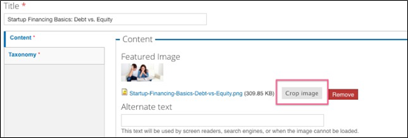
Select the ratio that you want to edit.
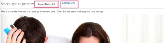
Figure 3‑45 - WYSIWYG image cropping
Then adjust and reposition the dotted square around the portion of the image that you want to display for that specific image ratio.
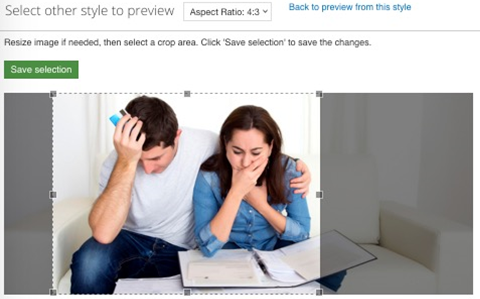
Figure 3‑46 - WYSIWYG image cropping
3.17 Referencing Content
3.17.1 Linking content
When linking to other pages or nodes in the CMS always use relative links. This is the portion of the URL following score.org. For example, the “Contact Us” page may appear as: http://www.score.org/contact-us (the absolute link), only the “contact-us” (without quotes) in the URL field. Only when linking to sites other than SCORE or for documents (PDF, Word, etc.) should you use the Open URL in New Window setting. Links within SCORE should open in the same window.
3.17.2 Node References
Another option for relating content within the CMS is through the use of “node references”. The node reference fields, unlike the link/URL fields, are pick lists. When using the node reference, enter the first few letters of the title of the node you wish to reference. You can use the auto-complete provide list to select the desired node.
3.17.2.1 Related Content
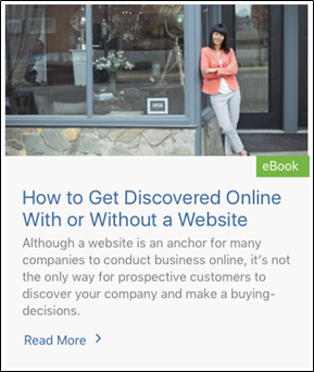
When “Referencing Content” on a node, the following fields are being pulled in based on the content type of the referenced page:
Basic Page / Landing Page
- Image (when available)
- Page Title
- Description/Summary
Figure 3‑47 - Node referencing display Figure 3‑48 - Node referencing display
Resource
- Image, when available
- Page Title
- Resource Type
- Resource Description
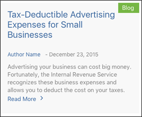
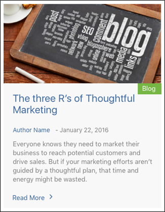
Blog
- Image, When Available
- Page Title
- Type
- Date Published
- Author
- Summary
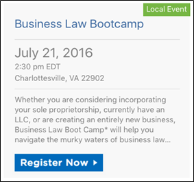
Event
- Page Title
- Event Type
- Date
- City, State, Zip, when available
- Summary
- Registration Link
Headline
- Page Title
- Date and Source
- Summary
- Headline Type


Success Story
- Image, when available
- Page Title
- Summary
- Client Name
- Client Title
Mentor Profile
- Mentor Name
- Image
- Status (Available / Unavailable)
- Location
- Summary
- Company Name
Authors/Presenters
- Image
- Summary
- Name
- Title
- Company
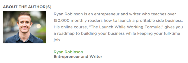
Figure 3‑49 - About the Author display
Sponsors
- Name
- Description
- Website Link
- More from Sponsor (landing page or basic page)
- Logo
- Label (“Brought to you By)
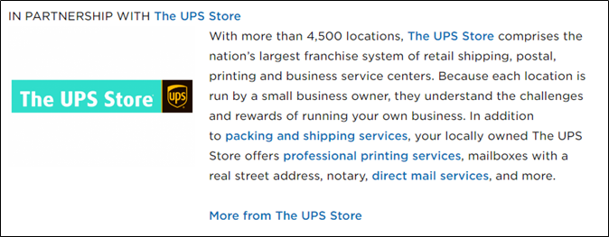
Figure 3‑50 - Sponsor display
3.17.3 Authors/Presenters
Authors can be associated with Resources, Blog posts and Events (as presenters). To associate an Author:
- Go to the “Edit” view of the node.
- Click the “Reference Content “ Tab
- Navigate to the "Author" Field
- Enter in the first few letters of the “Author Name” you wish to reference. Select the author’s name from the autocomplete listing.
3.18 Sponsors
Sponsors are not a Content Type. Sponsors are created via terms in the Sponsor Vocabulary. Once a Sponsorship “term” is created, it then becomes available for selection on the following content nodes:
Creating a Sponsor
- Navigate to Structure > Taxonomy > Sponsor
- Add a Term
- Complete the following fields on the Sponsor:
|
|
|
|
|
|
|
- Save
Sponsors added at the national level are not viewable by Chapters. However sponsors added at the Chapter level are viewable by the National team. They are not viewable by other Chapters.
3.19 Finding Content
3.19.1.1 Using Content Lists to “Find” Content
Once you have begun to enter content, you will need to find content to update it. You can sort through the content in the system by using the "Find Content" feature: (Screenshot below)
- In the Admin Toolbar, click on Content
- On the Content screen, use the filters to refine the list of content by status and/or type of content:
Title: Enter the Title of the content, or part of it
Type: Filter on Content Type (e.g., Blog Post, Landing Page)
Published: Filter on Published state (e.g., published, unpublished)
Format: Filter by Format (e.g. Local Event, Podcast)
Topics: Filter by content tagged with a term from the Topic Vocabularies
Chapter: Filter by Chapter ownership (only available to developers and system administrators)
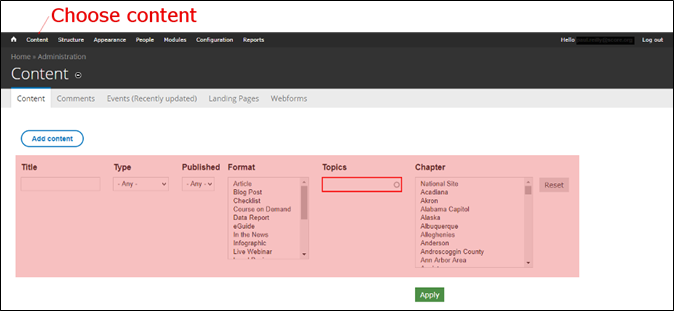
Figure 3‑51 - Content filter display
NOTE: You will need to reset the filters when you return to the content list, in order to filter on other parameters. Click the "Reset" button under the filters near the top of the page to do this.

